

What’s the difference between responsive and adaptive websites? That’s a question I get asked more and more often as the auto industry becomes savvier about their digital marketing efforts. In this article, we’ll discuss the pros and cons of these two popular website building techniques. Both are viable if implemented well, but responsive’s pros are steadily growing in number.
Adaptive Web Design
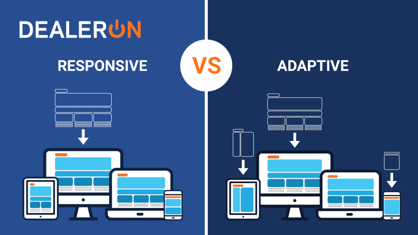
Adaptive Web Design works by first creating several distinct fixed layouts for multiple screen sizes. These layouts are typically broken down into 3 versions: Desktop, Mobile, and Tablet. When a visitor lands on the site, their user-agent is used to determine what type of device they are on, and displays the version that best matches the device.
Responsive Web Design
Responsive Web Design takes a fluid approach to design by having the website respond to the size of the browser and adjust its elements to fit within the available space. This means that no matter what device a visitor views the website from, the design elements and content of the page will dynamically shift to display themselves in the most optimal format possible.
With those descriptions it’s pretty easy to see where adaptive design has its limitations, and why ultimately responsive design is and will continue to be the most used design philosophy on the internet.
So why even talk about adaptive design at all? Initially popular because adaptive sites were a solution for a programmer with limited coding experience, time, or resources, these days responsive design sites have such a big pool of templates, forums, and developers, making responsive sites just as simple and quick to implement as adaptive. That’s the short version, but stick around for a detailed breakdown of the major pros and cons for each website type and you can make the decision for yourself.
Adaptive Automotive Websites Pros and Cons
Pros:
- Website will look good for the 3 most popular screen sizes
- Easy way to design a custom site with few pages
- Harder to break the design site wide
- Customizing 3 versions is easier and more intuitive for beginners
Cons:
- Can’t account for new or awkward-sized devices
- Difficult to make changes across site or across multiple pages
- Has issues dealing with users rotating their device from vertical to horizontal or vice versa
- Will require more and more versions as new screen sizes get introduced
Responsive Automotive Websites Pros and Cons
Pros:
- Websites look good on every screen size
- Recommended by Google
- Allows users to link to and share your content with a single URL
- Mobile devices with different screen sizes get custom fit designs
- Requires less engineering time to maintain multiple pages for the same content (especially useful for inventory pages)
- Reduces the possibility of the common mistakes that hurt mobile sites
- Future proof by design
Cons:
- Website creation is more time consuming
- Difficult for non-web developers to make design element changes
- If implemented incorrectly can significantly slow load times
So what’s better?
While the design of a site—adaptive vs. responsive—has only a tiny impact on SEO, there are more tangible benefits elsewhere. Automotive sales is a highly competitive market, and it’s imperative to maximize every advantage one has. In this regard, responsive is the clear winner.
First, look at it from the perspective of users. For example, I use a Samsung Galaxy S9+ with a 6.2 inch screen, my wife uses the smaller Pixel 3 with a 5.5 inch screen, and my sister uses the even smaller iPhone 7 with a tiny 4.7 inch screen. If we visit an adaptive design dealership website, all three of us are going to be shown the same mobile “version” of that site. Either that site isn’t making use of my 32% bigger screen and it’s not using space for related inventory, phone numbers, CTAs, and so on. Or it is, and the design is so cramped my sister can’t follow it. A responsive site solves all these issues, giving me, my wife, and my sister the ideal viewing experience even though we have wildly different devices. This is a clear advantage for the responsive website and in a SEO world where we’re fighting for the smallest edge this improvement can be the difference not just in converting a visitor but in search engine rankings as well.
Second, responsive design holds the advantage in future-proofing. An adaptive design can only be tailored to screen sizes that already exist, and in fact already leave many of those out. A responsive design is ready for the plethora of new devices that are released every month. If Apple abruptly decides to discontinue a specific model of iPhone and that was the one your adaptive design was tailored to, you’re out of luck. If you have a responsive site, no big deal. It’s ready for whatever curveball Apple decides to throw. That’s where responsive design really wins and will continue winning for the foreseeable future.
Adaptive websites were a useful, cheap, and valid choice while responsive websites were in their infancy in the distant time of 2012. In 2020, with the lower cost and better usability of responsive websites, there is not a single reason why anyone should pick an adaptive website over a responsive one.
If you have any questions, comments, or concerns leave them in the comments. We’d love to hear from Dealers on their experiences with either technique.