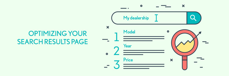
The grass is always greener on the other side, so we’re all searching for something better. That includes your site visitors. Your search tool is one of the most popular tools on your site, and if you’re not optimizing your SRPs, you’re missing out on a huge opportunity for conversions. We did some research and found what tools, designs, and other aspects you should include on your SRPs.
Continue Reading
It’s a wide, wide web out there, and there are lots of tools and resources you can use to reach your potential new clients, but are you making your site available to them all? If you’re not considering multiple browsers while designing your site, then that’s a definite no.
It’s easy to get caught up in Chrome – which is the most popular browser out there, beating the others by a whooping 44%. But you can’t ignore the well-known Safari or the notorious Internet Explorer, not to mention the countless other browsers available to the users of the world wide web, i.e. everyone. So how do you design with multiple browsers in mind? Keep these basic practices in mind and you’ll be off to a good start.
Continue Reading
To err is human, and to get an error page is just another part of having a website. We’re all uncomfortably familiar with the 404 error page, but that’s just the tip of the iceberg. There are plenty of other ways you can cause an error on your website, and a few things your visitors can do too. If you find yourself at a loss when trying to decipher an error page, start here with our guide to the most common ones, especially if you’re trying to decide if the problem is due to your site or if it is caused by a visitor’s browser.
Error 404 Not Found
We’ll start off with the notorious 404. Anyone who’s used the Internet has encountered this one. A 404 error occurs when a visitors tries to access a web page or resource that doesn’t exist. The fault could be with either you as the website owner, like if you moved a page without redirecting (we’ve got some tips on that too), or it could from a mistyped URL, which would make it the user’s issue.
Continue Reading
It’s hard to keep up in the ever-evolving world of mobile devices. Earlier this year we wrote about design features for mobile that should never see the light of day, and all of that is still true, but you still have to figure out what your site should look like when someone’s holding it in their hand. Lucky for you, there are a few design elements that won’t be losing their effectiveness anytime soon. If you stick with them, you’ll be headed in the right direction.
Continue Reading
Put your most important information above the fold — that’s what the newspaper editors of old did, and it’s a practice that web developers still follow today. Above the fold content includes anything position in the uppermost part of a webpage, where it is visible to users without scrolling. When you only have four seconds to get your visitors’ attentions, it makes sense to optimize your above-the-fold content in order to keep them coming back for more, but once you’ve got them caught, how do you reel them in?
As soon as your users get started in the buyer’s journey, you need to start thinking about the rest of your page design. Not optimizing your below-the-fold content means you’re missing out on some great opportunities to turn a lead into a buyer.
Stick to these best practices when it comes to optimizing for the bottom of your webpage page, and you’ll be heading to the top in no time.
Continue Reading