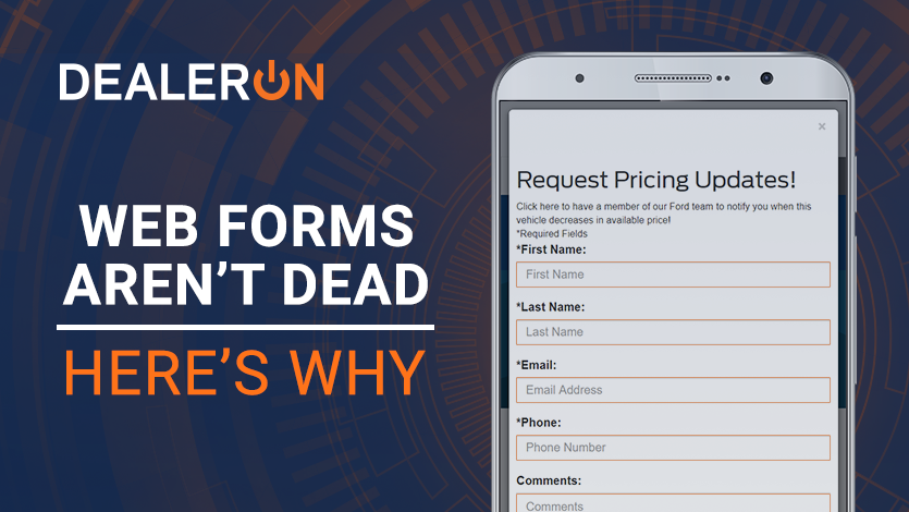

You may have heard “no one uses forms anymore” or worse yet the proclamation that “web forms are dead”. Contrary to those industry talking heads who are slinging the latest greatest shiny, web forms are not only VERY much alive and kicking, but also remain one of the most cost effective and tried and true ways to generate leads for your dealership. The game has no doubt changed, from chat to digital retailing, there are more way to engage with your customers than ever before, all with their own sets of challenges. Auto responders, wait-times, poor user experience, too much information being collected, and a slew of other problems all can lead to visitor’ bouncing over frustration. Still, they’re all worthwhile investments, but not first optimizing lead forms to uncover the hidden gold in your website is like dumping water into leaky bucket.
Whether on mobile or desktop, DealerOn has spent a ton of time testing to make sure each and every form on our websites are optimized to get you as many leads as possible. Don’t have a DealerOn website? Don’t worry we have you covered with a few tips that ANYONE can implement. It will cost you nothing and you might double or even triple your lead volumes.
5 Tips to optimize your webforms
- Fewer Form Fields: less is more:
In this day and age attention spans are practically zero. This is especially true of your mobile users who are much more likely to make a phone call (you should optimize for these too!) than to fill out a lead form. One of the biggest mistake dealers make is trying to collect too much information from their customers. If you want to increase your chances of someone filling out a lead form, make sure you only collect what is ABSOLUTELY necessary. In most cases that would be First Name, Last Name, Telephone, and Email Address. Anything else is absolutely unnecessary and each incremental field you ask for can reduce your chances of someone filling out the form by as much as 25% per field. Get the basics so you can engage with your users, don’t worry about the rest, you can get it later. - Create a strong call to action:
What is your user getting for the precious information provided? No one wants to submit to your form and yet SO many lead forms across the internet go with the default “submit button”. The CTA or Call to Action button is one of the most overlooked elements of a form and it can make or break whether a user ultimately clicks that button. It is your last best chance to “sell” to your customer, so make sure it is providing value. It should not only be reinforcing whatever messaging you are pushing, but also drive additional interest. For example, if you are showcasing discounted pricing and have messaging about the fact that you turn your inventory daily and that you should check in with us regularly; using a CTA that read something like “request sale price” not only reinforces the messaging, but also has the potential to persuade that customer to send in a lead in the hopes of receiving a better price. As a salesperson you now have an opportunity to engage with this customer and understand their stated intent. - Multi-Step Forms:
One thing we run across all the time on other website providers sites are extraordinarily long web forms for things like credit applications. Scrolling forever may be the norm when it comes to social media sites like Facebook or Instagram, but there is nothing that will get a user to bounce from a form faster than a wall of form fields. Instead minimize and organize your form step by step collecting minimal amounts of information each time. Multi-step forms, especially for things like credit applications, make filling out forms on mobile, and even desktop infinitely easier and less overwhelming for users. - Mobile Tap Targets:
One of the big things that Google pushed very hard back in the early days of mobile website optimization was “tap target” sizes. Effectively this means making sure that the elements of your website that a user interacts with, like buttons and form fields are large enough that those of us with larger fingers can easily target them without accidentally hitting another element, or worse yet having to pinch and zoom. This is especially important to get the most out of mobile forms. - Clear and concise headline/title:
Seems like a no-brainer, but often times missed. Just like the all to action providing a catchy title that drives the user to interact with your form is of critical importance. Why should your customer provide you with their information? Making sure you have a strong message and title that aligns with your call to action is the first step in getting users to fill out those forms.
There are plenty of other technical and non-technical things you can do to get even more juice from your lead forms. By implementing the tips above, you are ensuring that not only are you creating a great user experience, but as a result you should see a marked improvement in your lead counts from your website! Remember there are lots of great tools out there to help drive leads and engagement, but making sure that you take care of the single most important digital asset you have, your website, before investing anywhere else will help pave the way for future success.


